CASE STUDY 7
At Artwork Flow, I worked closely with the product team as the go-to UX copywriter. When I joined the team, the product was undergoing a design overhaul. Aesthetics met functionality under the pleasing spotlight of a revised brand outlook. This called for copy that helped users get down to business, with no fluff to slow them down.
Most of my time was spent figuring out how to make things inside the product easier to understand and use. With unique modules adopted by various user profiles, this meant creating copy that would translate easily across teams.
New modules and updates were rolling out every week, and the challenge was always the same. How do we explain complex features and functions with total clarity?
Timeline
November 2022 - September 2024
Industry
B2B SaaS
Scope of work
UX Writing
Product Education
User Engagement
Give users language that helped them move faster and stay in flow.
Build consistency across the product so they didn’t have to relearn how things worked.
Make sure our microcopy didn’t confuse people or slow them down.
Help reduce support requests by pre-emptively answering common questions inside the product.
Before this, copy was being added without an underlying structure or system.
Users required dedicated customer support to navigate errors due to limited information.
Each feature had its own audience and mental model. The language had to account for both internal logic and user context.
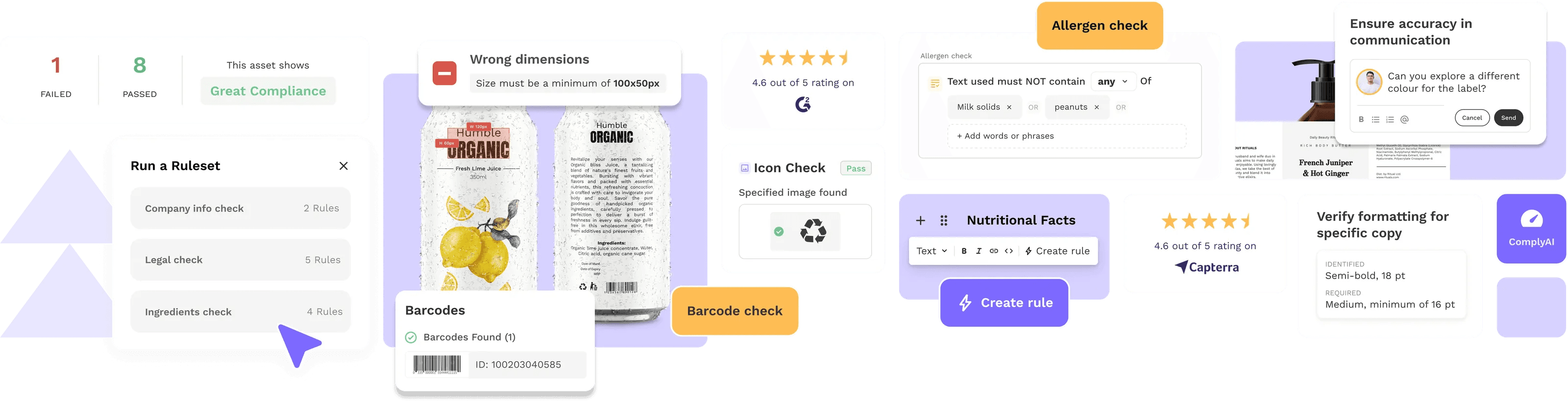
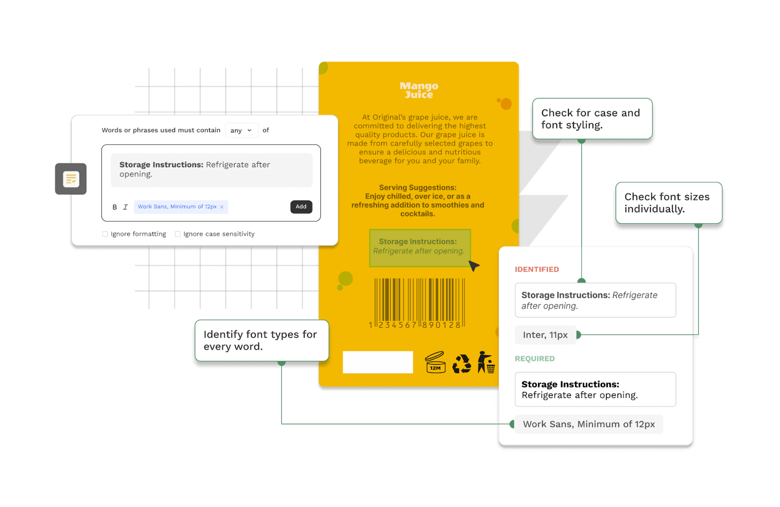
1. Naming Things (Properly)
Whenever we rolled out a new feature or component, I’d start by looking into:
What terms do our users already use for this kind of thing?
What are our competitors calling it and why?
What do our PMs, designers, and customer success folks think users expect to see here?
From there, I’d work out naming conventions that were intuitive and consistent.
Error messages. Button labels. Loaders. Notifications. Everything followed the same approach. Each line had to be helpful, unobtrusive, and on-brand.
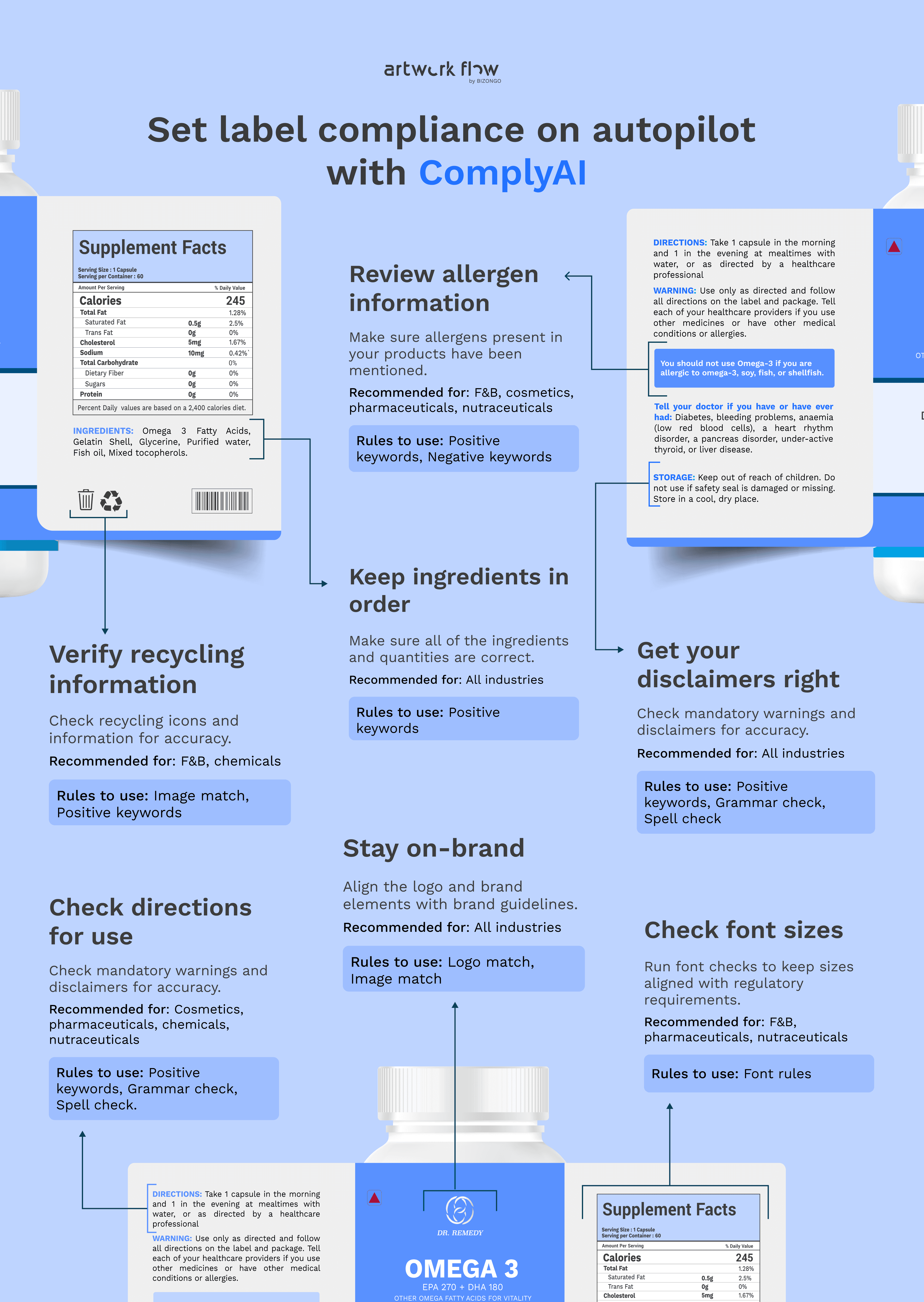
2. Scaling Help Without Human Support
To make sure users could self-serve as much as possible, I created:
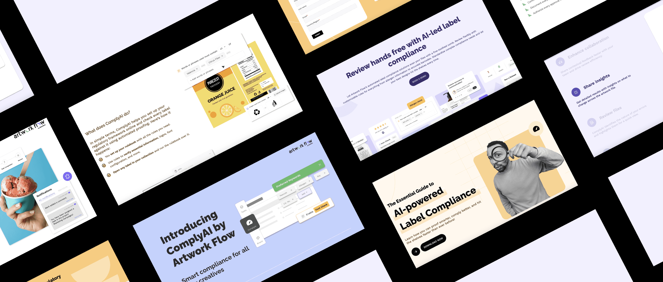
A clean library of help articles, walkthroughs, and feature updates.
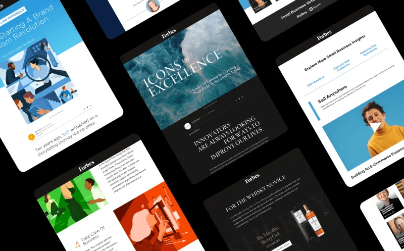
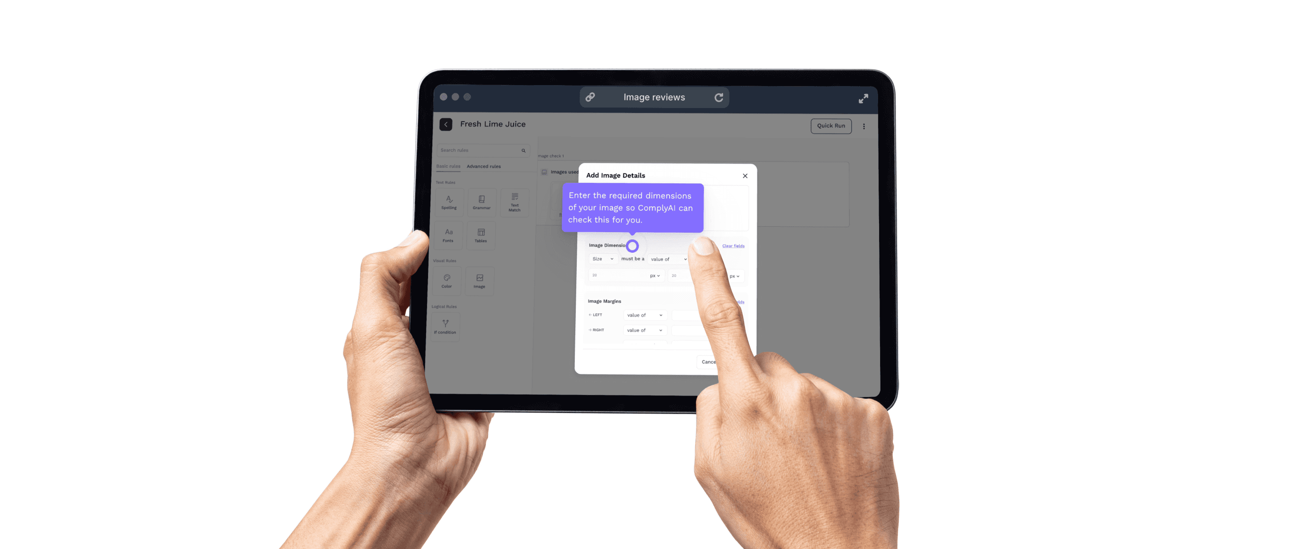
Screenshots, demo videos, and tooltips wherever needed.
Product release blogs that didn’t feel like release notes.
3. Keeping Enterprise Users in the Loop
I introduced a monthly product newsletter for our enterprise users (~2,000 people). It included:
What’s new (and why it matters).
Feature walkthroughs and visual guides.e
Downloadables like ebooks and infographics.
Open rates hit 25% on average, with our best hitting 28%.
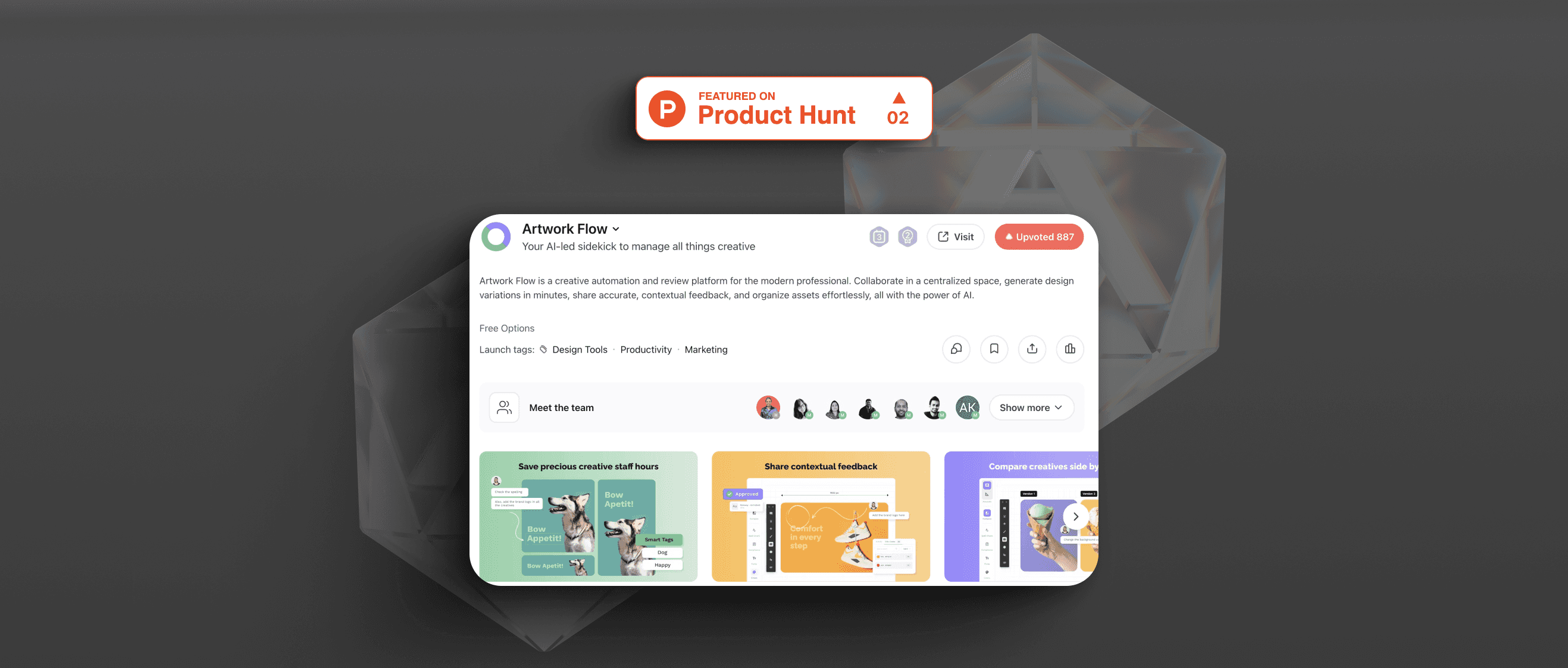
4. Onboarding for the Freemium Launch
As part of the launch of our freemium model on Product Hunt (where we finished 2nd for the day), I helped rework our onboarding copy for self-serve users. That included:
Product microcopy tailored to individuals and small teams.
A two-week onboarding email sequence with helpful nudges.
A polished experience that made people want to keep exploring.
(I’ve broken that launch down separately here if you’d like a deeper look.)
Created a central system for product communication, with cohesive, user-first product language across the board.
Reduced friction across new user journeys through cleaner, logic-based interface copy.
Improved user education and adoption through help articles, demos, and newsletter content.
Helped establish a voice for the product that felt clear, confident, and approachable.
Writing effective UX copy begins and ends with simplification:
Good product language builds memory, predictability, and trust.
The right UX copy will be useful, readable, and clear, even when your UI gets complex.
The best outcomes happen when writers are embedded within product teams, not added after.